The Belgium Choropleth Map Excel Template allows you to create a map of Belgium, broken down by regions, with each region colored according to how they rank against a specific metric. It is a highly effective method, that can be used for any given metric that you want.
The Belgium Choropleth Map Excel Template allows you to create a map of Belgium, broken down by regions, with each region colored according to how they rank against a specific metric. It is a highly effective method, that can be used for any given metric that you want.
Struggling to visualize Belgian data by region in a way that’s clear and impactful? The Belgium Choropleth Map Excel Template is your perfect solution for creating stunning, color-coded maps directly in Excel.
Effortlessly display differences across regions for any dataset, from demographic stats to sales figures, using interactive, customizable visual maps.
Developed by Excel data visualization experts, this template leverages proven design principles to turn raw numbers into meaningful insights.
Trusted by educators, analysts, and professionals alike, it comes with region lists, city names, and customizable settings for precise, reliable results every time.
Features:
Sorry! No Reviews Yet!
At the moment, we don't have any reviews for the Belgium Choropleth Map Excel Template.
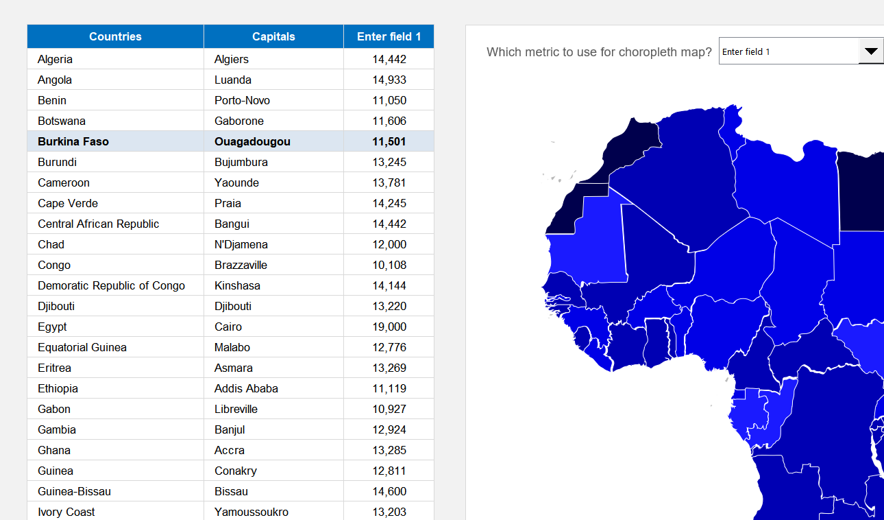
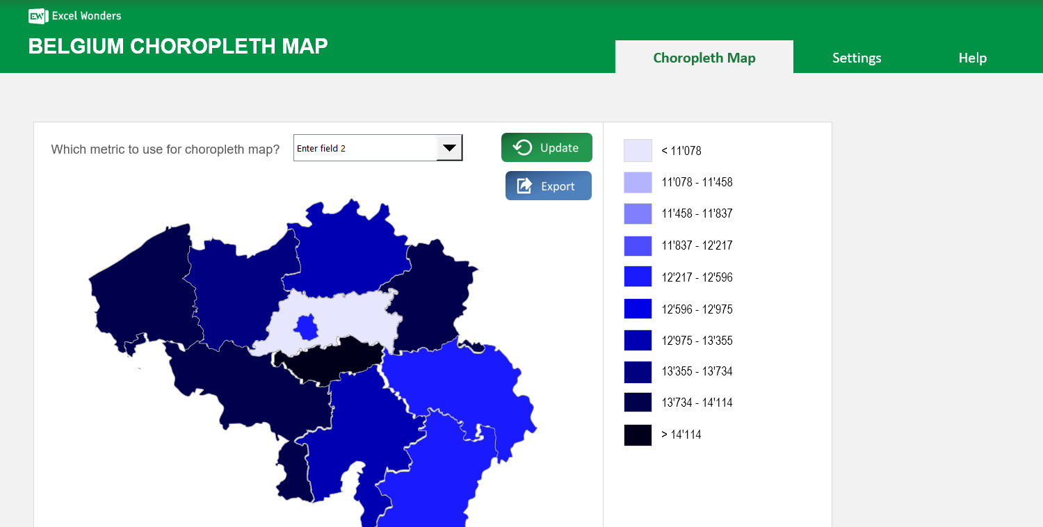
This template creates a choropleth map of Belgium where each region is color-coded based on its value for a specific metric. You can use it to visualize any region-level dataset.
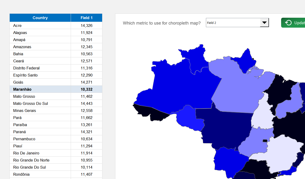
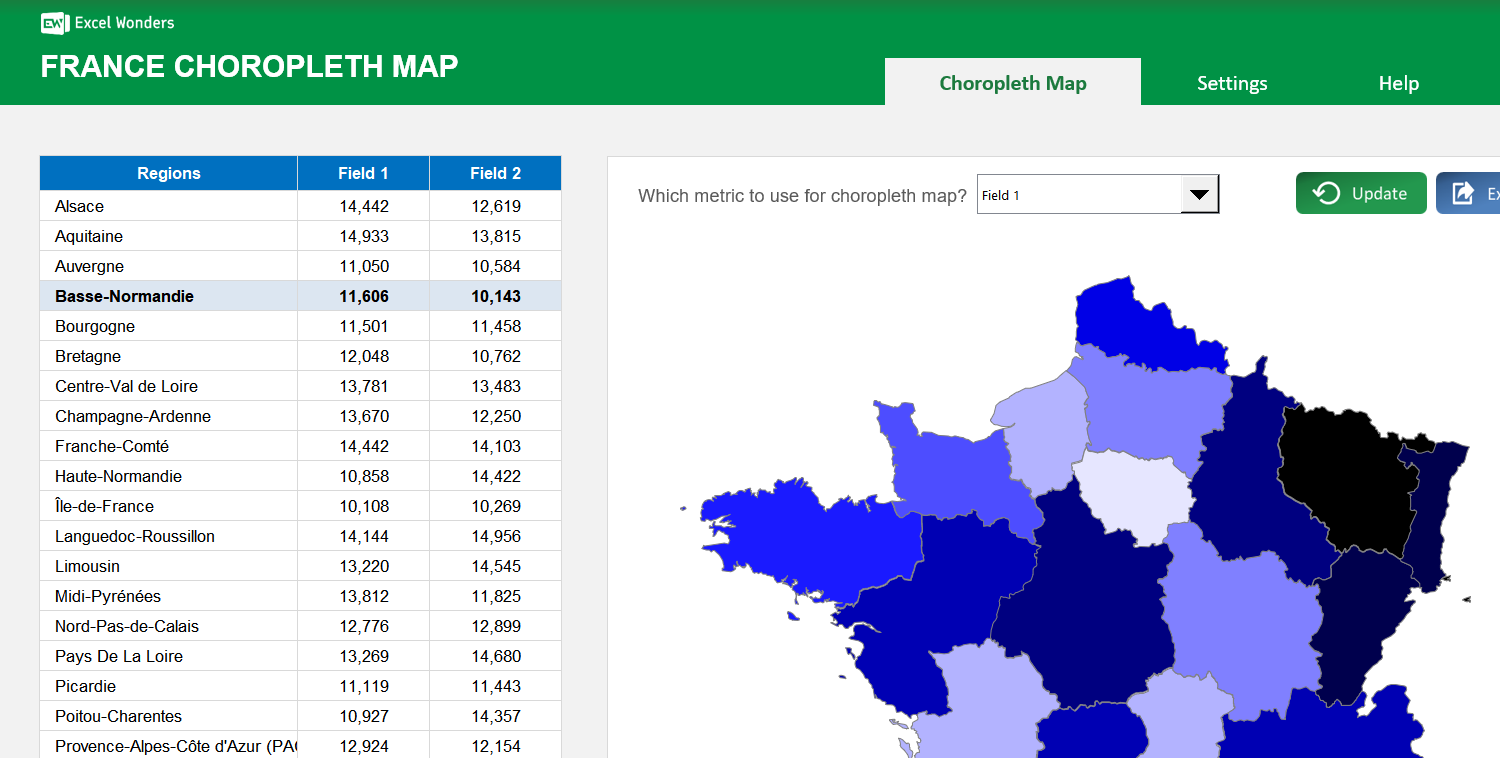
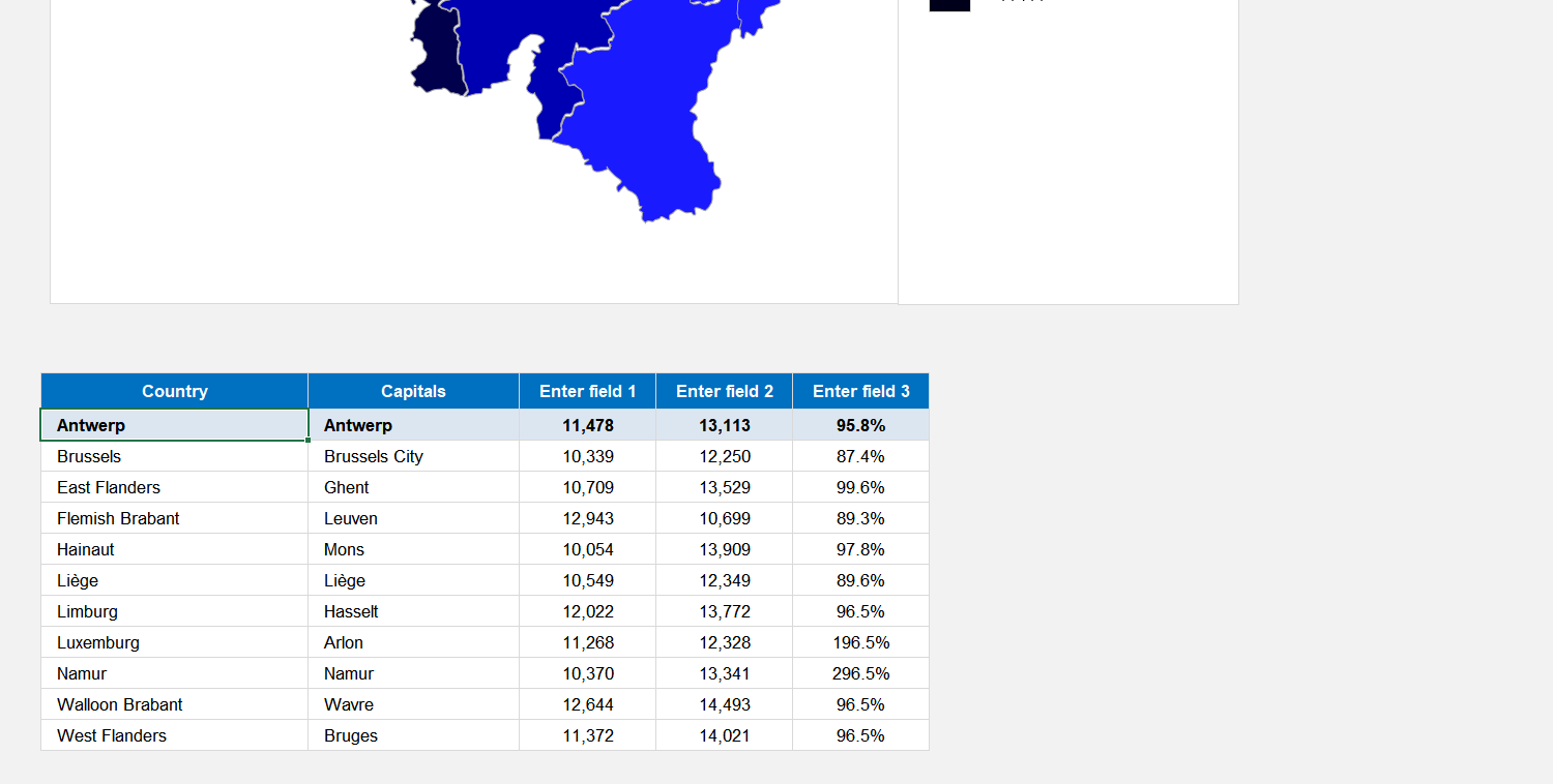
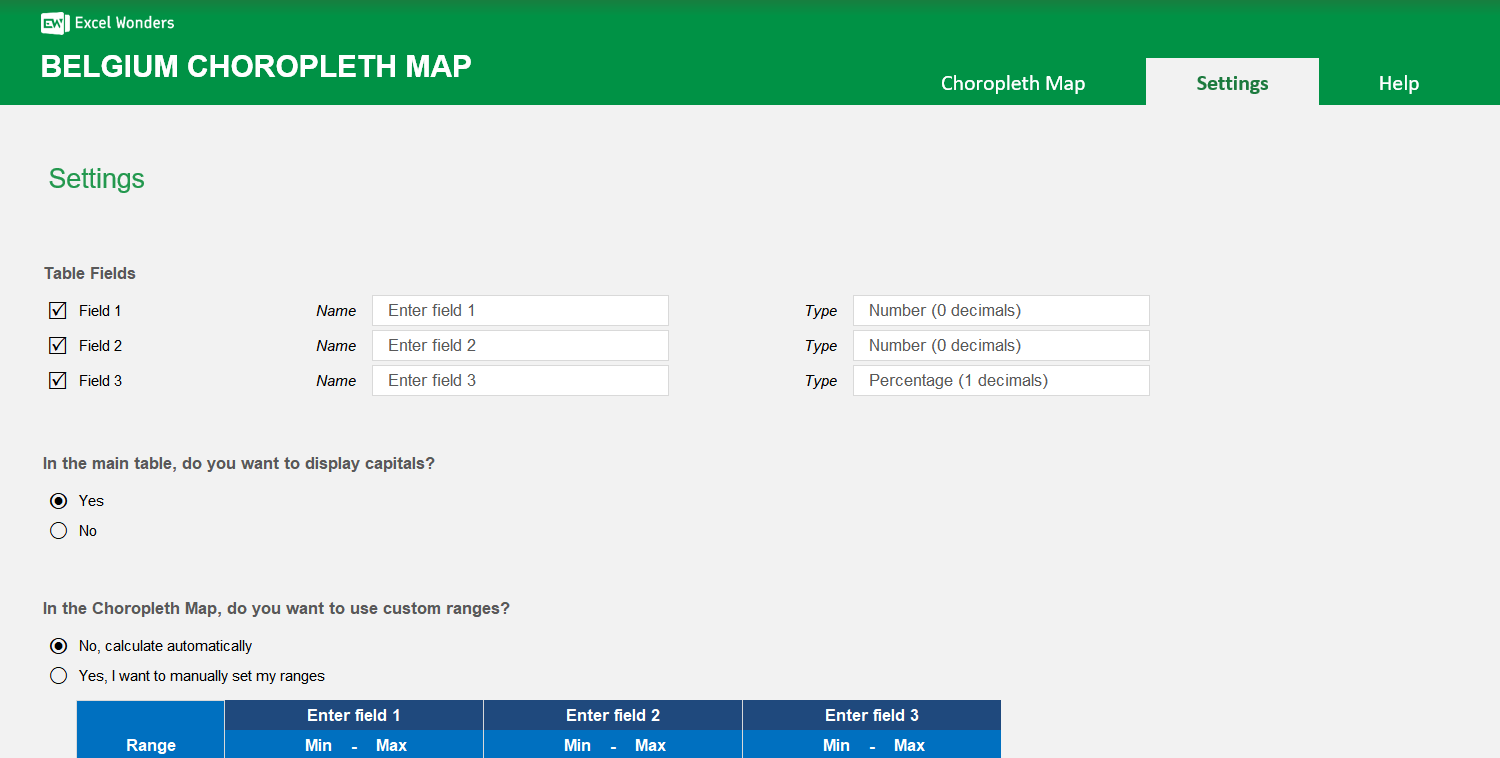
The data table supports up to three data fields per region. Enter your values directly into the table. To customize the field names or to show only one or two fields, go to the "Settings" sheet.
Yes. In the "Settings" sheet, you can set the number format for each data field. Options include absolute number (0 or 1 decimal place) and percentage (0 or 1 decimal place).
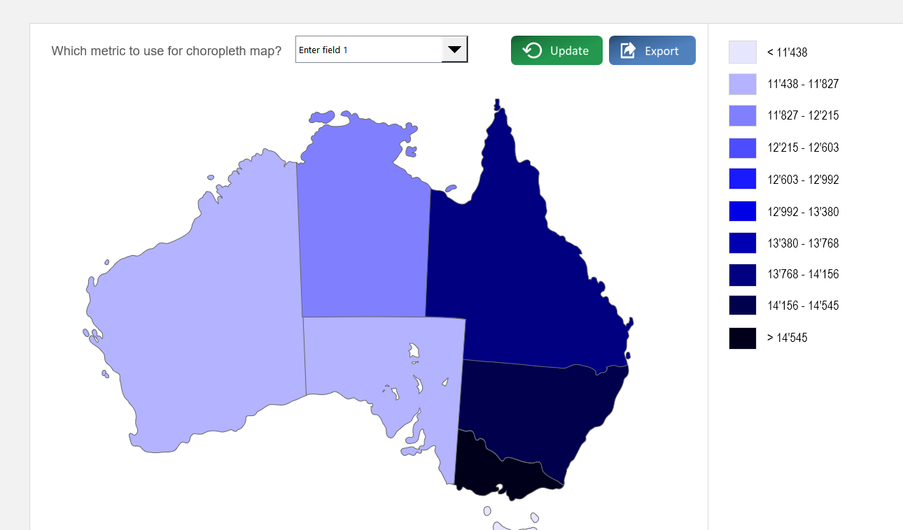
On the "Choropleth Map" sheet, use the dropdown menu located above the map to select which of the three data fields to visualize. The map's colors will update automatically.
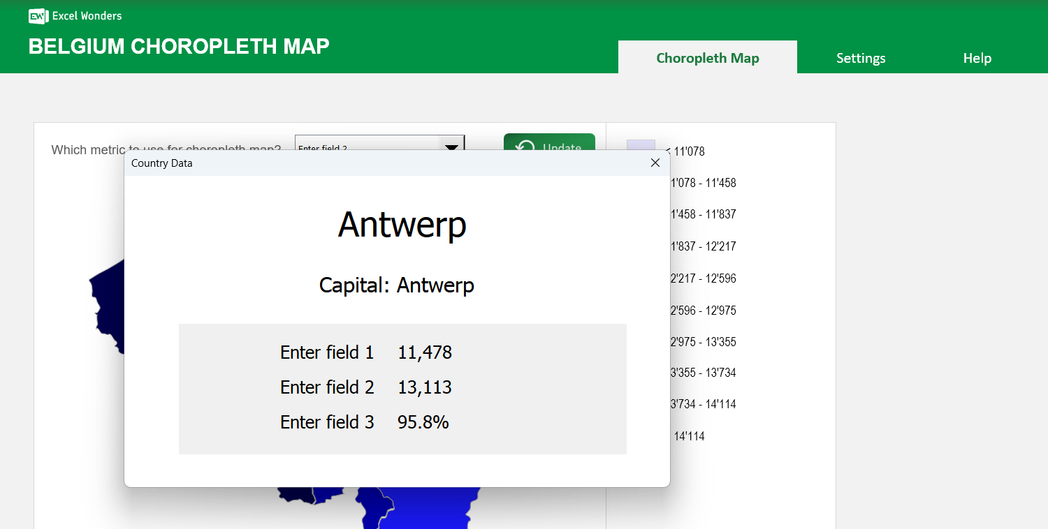
Click on any region directly on the map. A pop-up window will appear displaying that region's name, capital (if enabled), and data for all active fields.
Yes. Go to the "Settings" sheet and set the option for capital visibility to "No". This hides the capitals column in the data table and removes them from the region-specific pop-up.
In the "Settings" sheet, you can choose between two methods: Automatic Ranges, where the template divides your data into 10 even ranges, or Manual Ranges, where you define up to 10 custom data ranges.
Yes. Both the region color scheme and the map background color can be changed in the "Settings" sheet. Use the provided dropdown menu and color picker to make your selections.