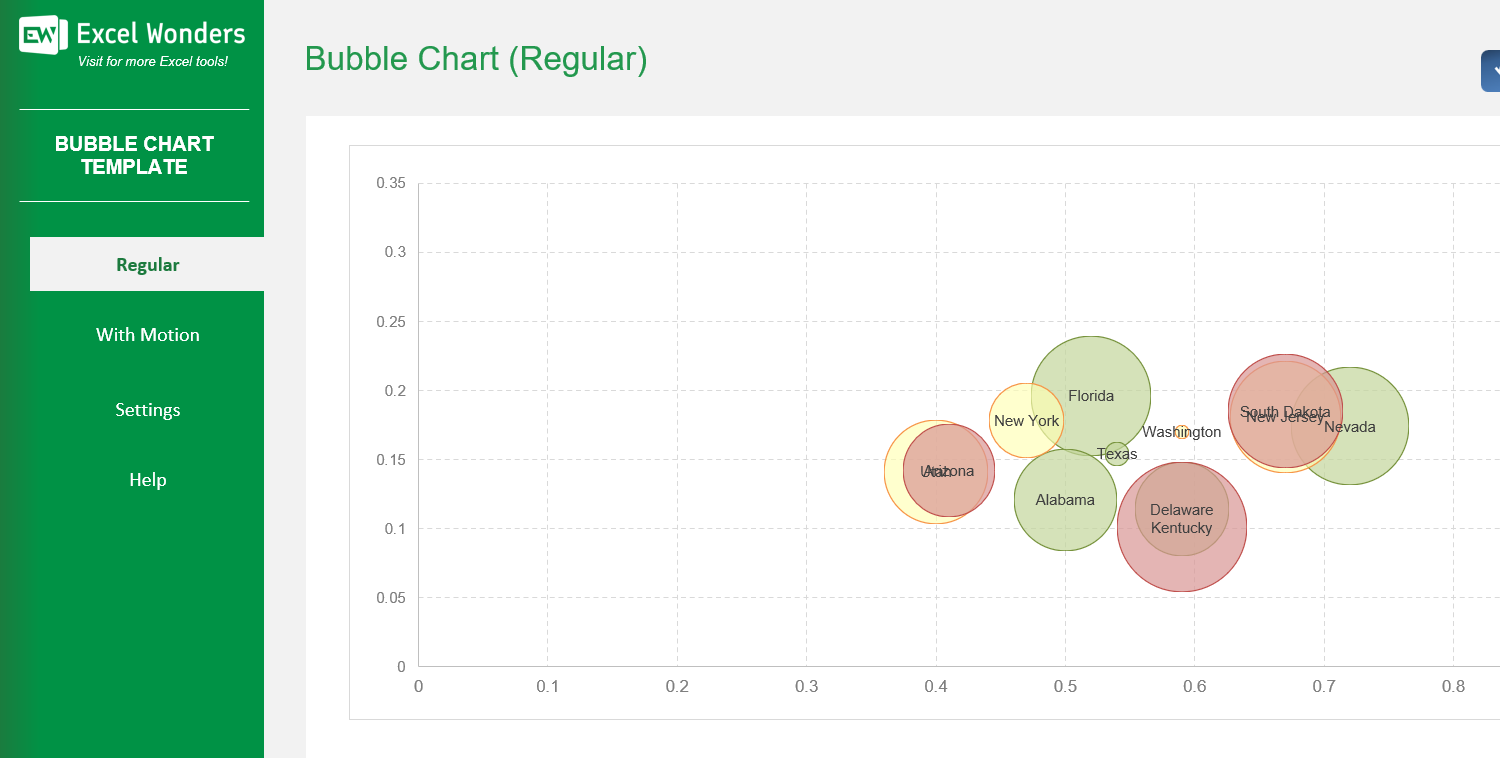
The Bubble Chart Excel Template allows you to create highly customized bubble charts. A bubble chart is commonly used to visualize relationships between three numeric variables. Each bubble represents a single data point, and is positioned against 2 metrics in X and Y axises.
The Bubble Chart Excel Template allows you to create highly customized bubble charts. A bubble chart is commonly used to visualize relationships between three numeric variables. Each bubble represents a single data point, and is positioned against 2 metrics in X and Y axises.
Our Bubble Chart Excel Template is the fast, professional solution for creating clear, impactful visualizations directly in Excel.
Turn raw figures into easy-to-read static or animated bubble charts that reveal trends over time. Perfect for portfolio management, project tracking, or any data analysis task.
Developed by Excel specialists with years of experience, this template is optimized for accuracy, flexibility, and ease of use—no coding required.
Trusted by analysts, marketers, and managers worldwide, it comes with clear instructions, built-in customization options, and full compatibility with modern Excel versions.
Features:
Sorry! No Reviews Yet!
At the moment, we don't have any reviews for the Bubble Chart Excel Template.
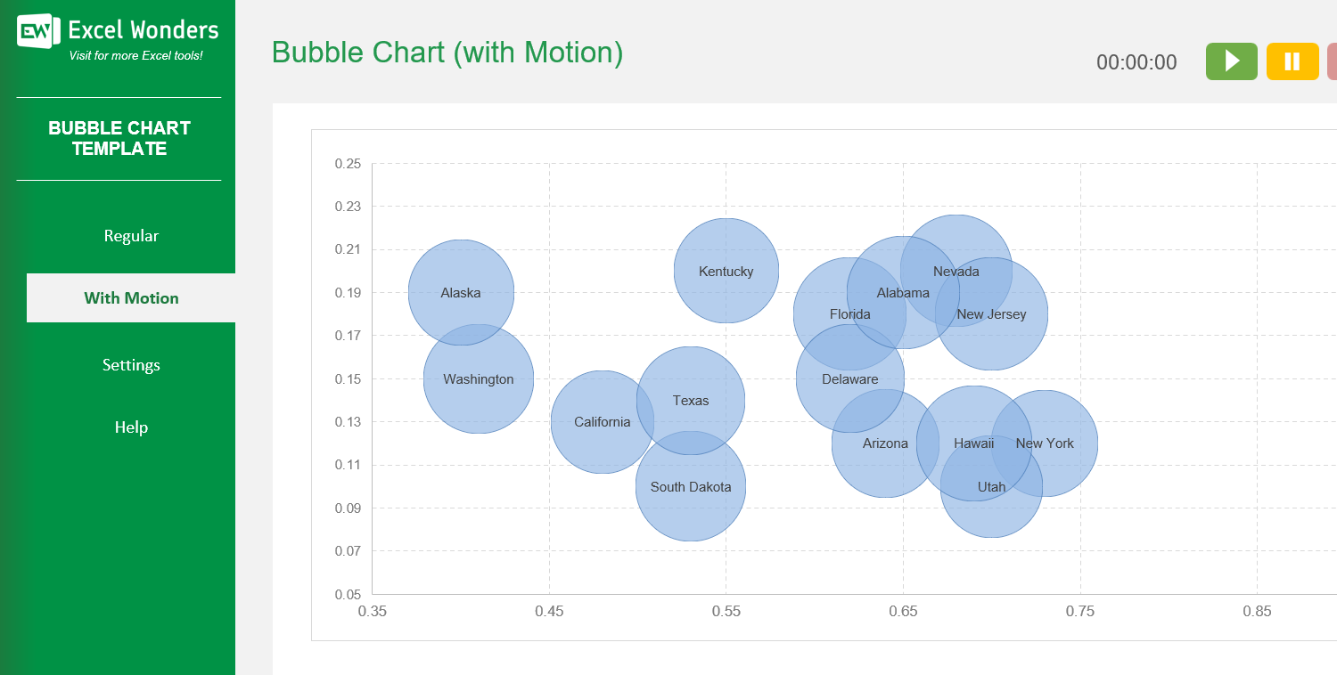
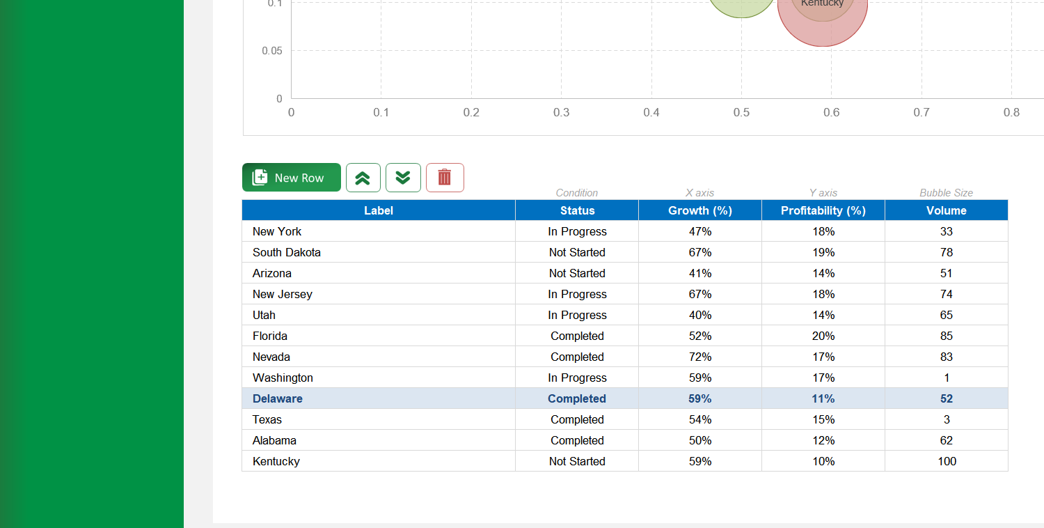
The template offers two types of bubble charts: • 'Regular': Creates a standard, static bubble chart. • 'With Motion': Creates an animated bubble chart that transitions through three distinct time periods or stages.
On the 'Regular' sheet, use the data table located below the chart. You can edit data directly, add a new entry with the 'New' button, delete an entry, or reorder the rows.
Yes. Click the 'Export' button in the top-right corner. In the pop-up window, configure the file name, type, and location, then click 'Export' to save the chart as a separate file.
If the chart does not refresh automatically after you edit the data table, click the 'Update Chart' button in the top-right corner to apply your changes.
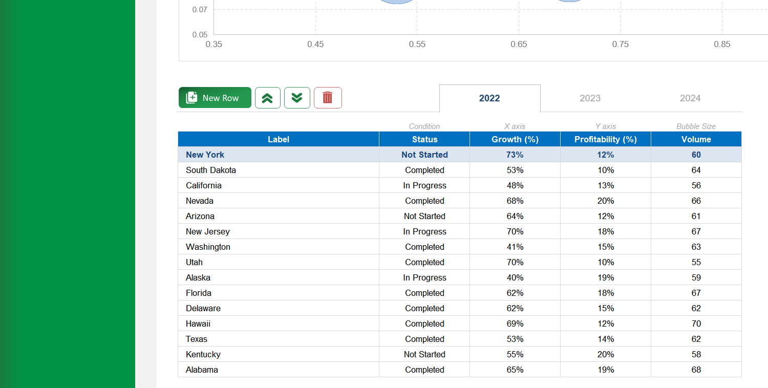
The three tabs above the data table represent the different stages for the animated chart (e.g., years, quarters). Click a tab to view and edit the data for that specific period.
On the 'With Motion' sheet, use the data table below the chart. You can edit data for the selected period, add a new entry with the 'New' button, delete an entry, or reorder the rows.
Go to the 'Settings' sheet. You will find an option to set the animation pace by entering the number of seconds you want between each period transition.
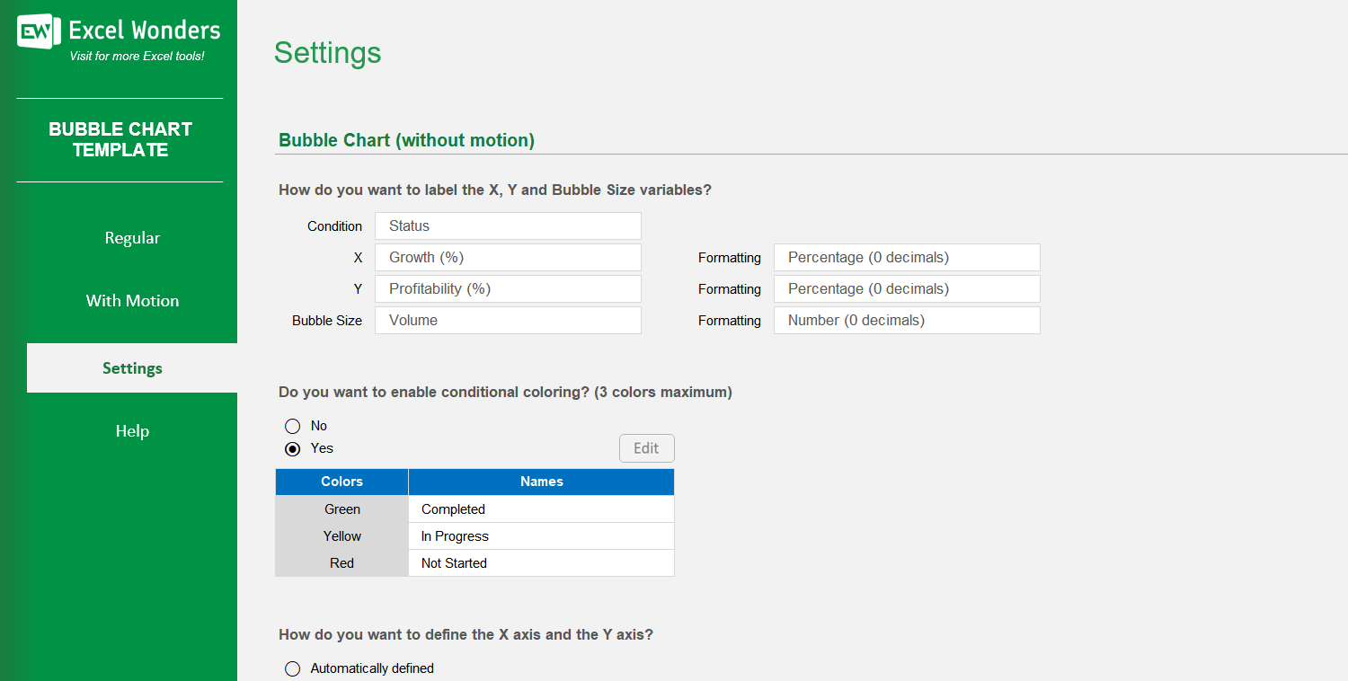
Yes. On the 'Settings' sheet, you can configure the X and Y axes: • Automatic: Excel sets the axis values based on your data. • Manual: You can enter your own custom minimum and maximum values for each axis.
Conditional coloring automatically colors bubbles based on a category. In 'Settings', you can enable this feature and define labels for up to three colors. Bubbles with a matching label in your data will appear in the assigned color.
Yes. You can customize the column headers for the data tables on both the 'Regular' and 'With Motion' sheets by editing them in the designated area on the 'Settings' sheet.