The Doughnut Chart Excel Template allows you to create highly customized doughnut charts, which show the relationship of parts to a whole, and assess the proportion of each item of a given list to the total sum of all items within that same list.
The Doughnut Chart Excel Template allows you to create highly customized doughnut charts, which show the relationship of parts to a whole, and assess the proportion of each item of a given list to the total sum of all items within that same list.
Tired of struggling to present data clearly in Excel? Our Doughnut Chart Excel Template makes it easy to create stunning charts that show how parts relate to the whole—perfect for reports, dashboards, and client presentations.
This donut chart template for Excel offers both static and animated chart options, so you can either display a snapshot of your data or highlight changes over time for maximum impact.
Developed by Excel specialists, it includes intuitive editing tools—no advanced Excel skills required. Simply edit, add, or reorder data rows, and your chart updates instantly.
Thousands of professionals trust Excel Wonders for accurate, customizable, and easy-to-use templates that save time while elevating visual storytelling.
Features:
Sorry! No Reviews Yet!
At the moment, we don't have any reviews for the Doughnut Chart Excel Template.
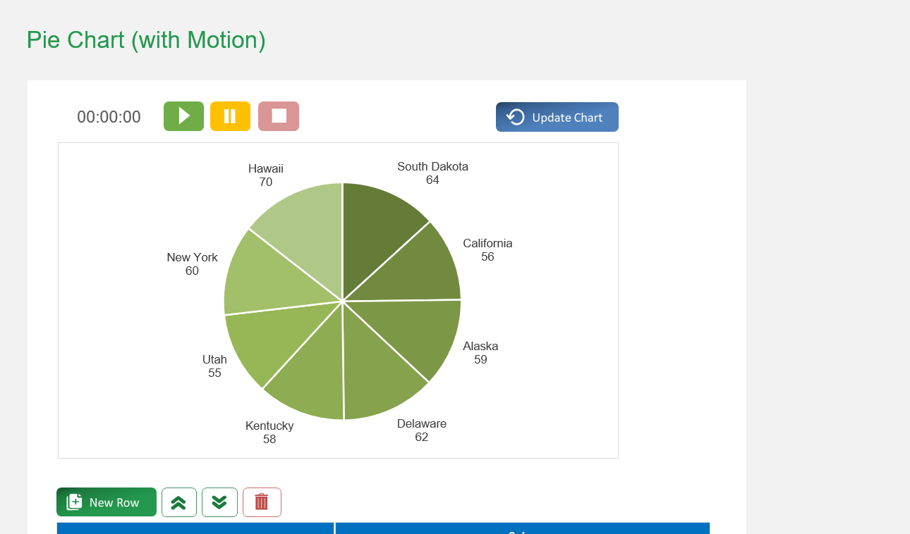
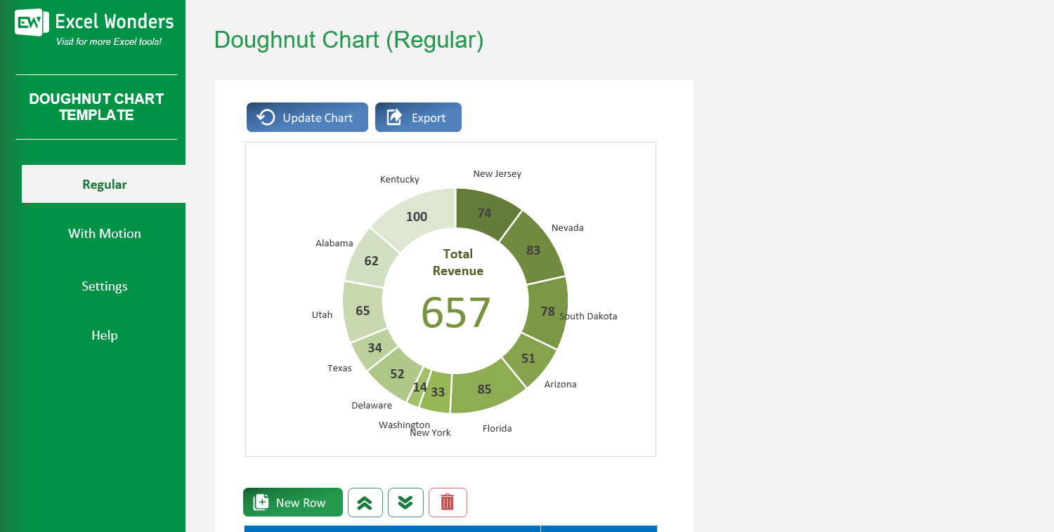
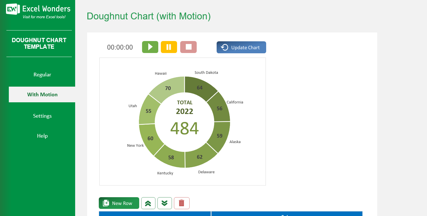
The template offers two types of doughnut charts: • 'Regular': Creates a standard, static doughnut chart. • 'With Motion': Creates an animated doughnut chart that transitions through three distinct time periods or stages.
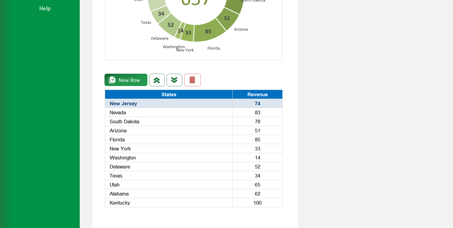
On the 'Regular' sheet, use the data table located below the chart. You can edit data directly, add a new entry with the 'New' button, delete an entry, or reorder the rows.
Yes. Click the 'Export' button in the top-right corner. A dialog box will appear where you can set the file name, type, and location to save the chart as a separate file.
If the chart does not refresh automatically after you edit the data table, click the 'Update Chart' button in the top-right corner to apply your changes.
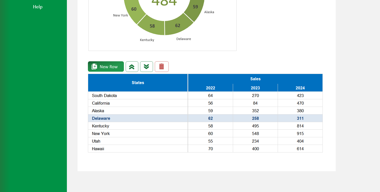
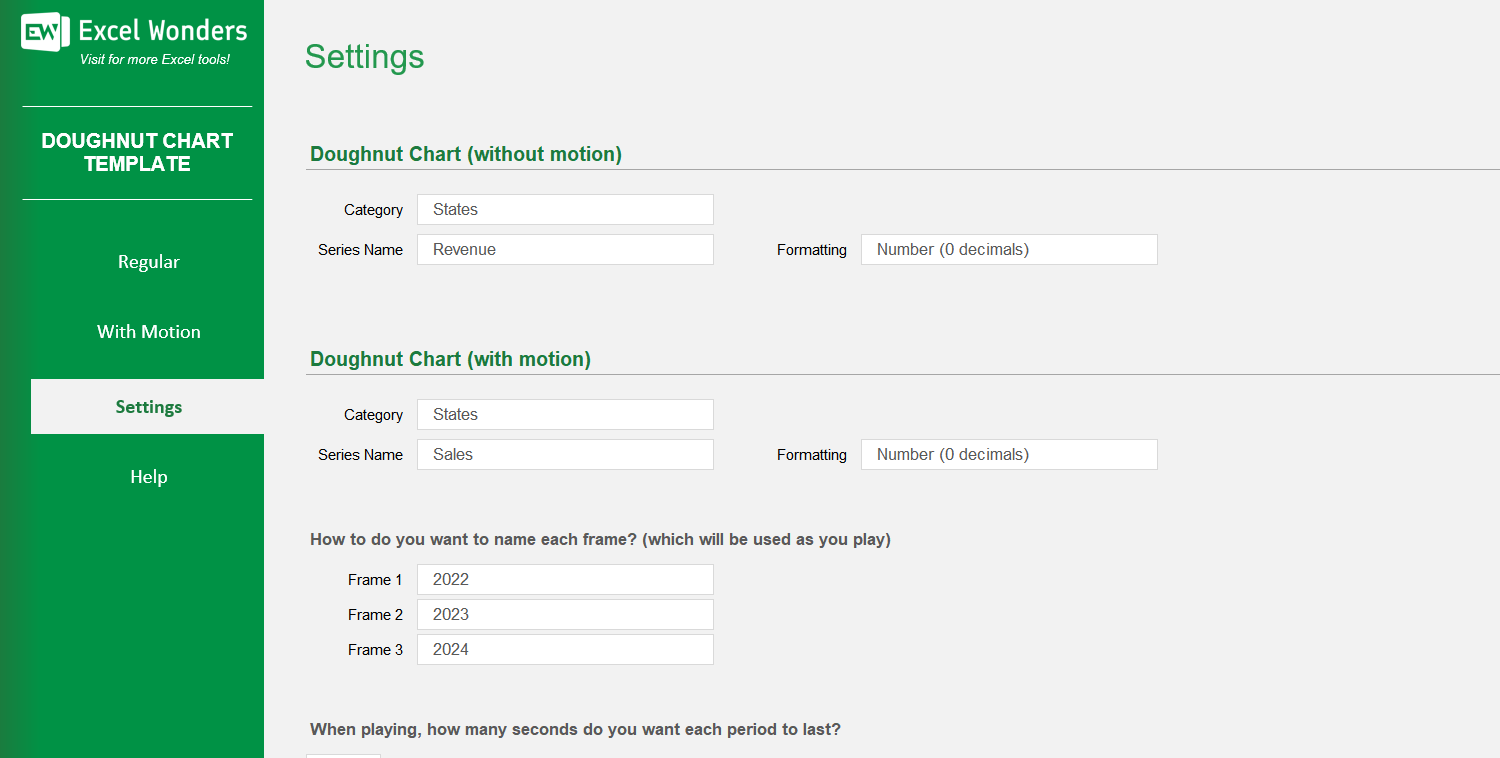
The three data columns represent the different stages or periods for the animated chart (e.g., years, quarters). You can enter the values for each period in these columns and customize their labels in the 'Settings' sheet.
On the 'With Motion' sheet, use the data table located below the chart. You can edit data directly, add a new entry with the 'New' button, delete an entry, or reorder the rows.
Go to the 'Settings' sheet. You will find an option to set the animation pace by entering the number of seconds you want between each period transition.
Yes. You can customize the column headers for the data tables on both the 'Regular' and 'With Motion' sheets by editing them in the designated area on the 'Settings' sheet.