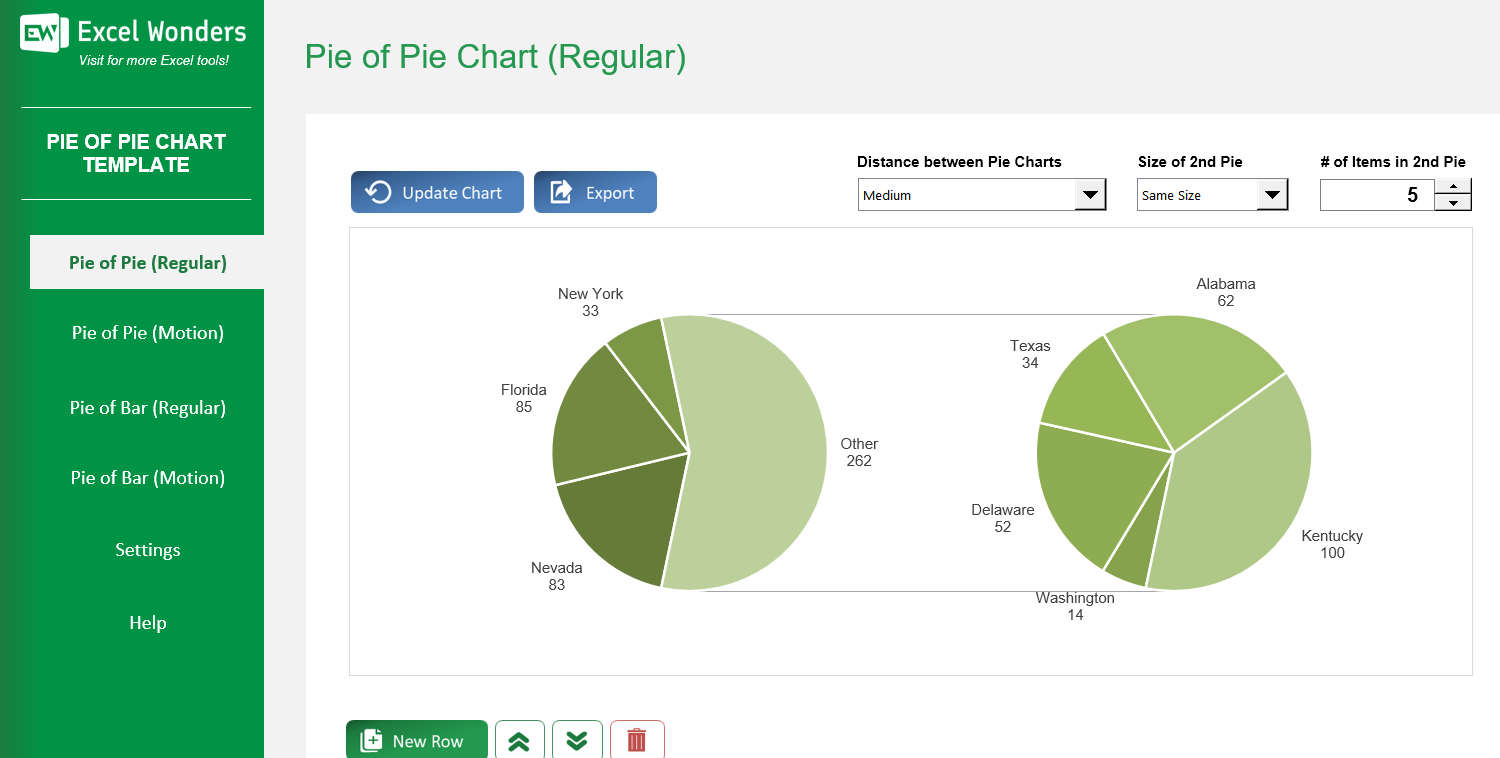
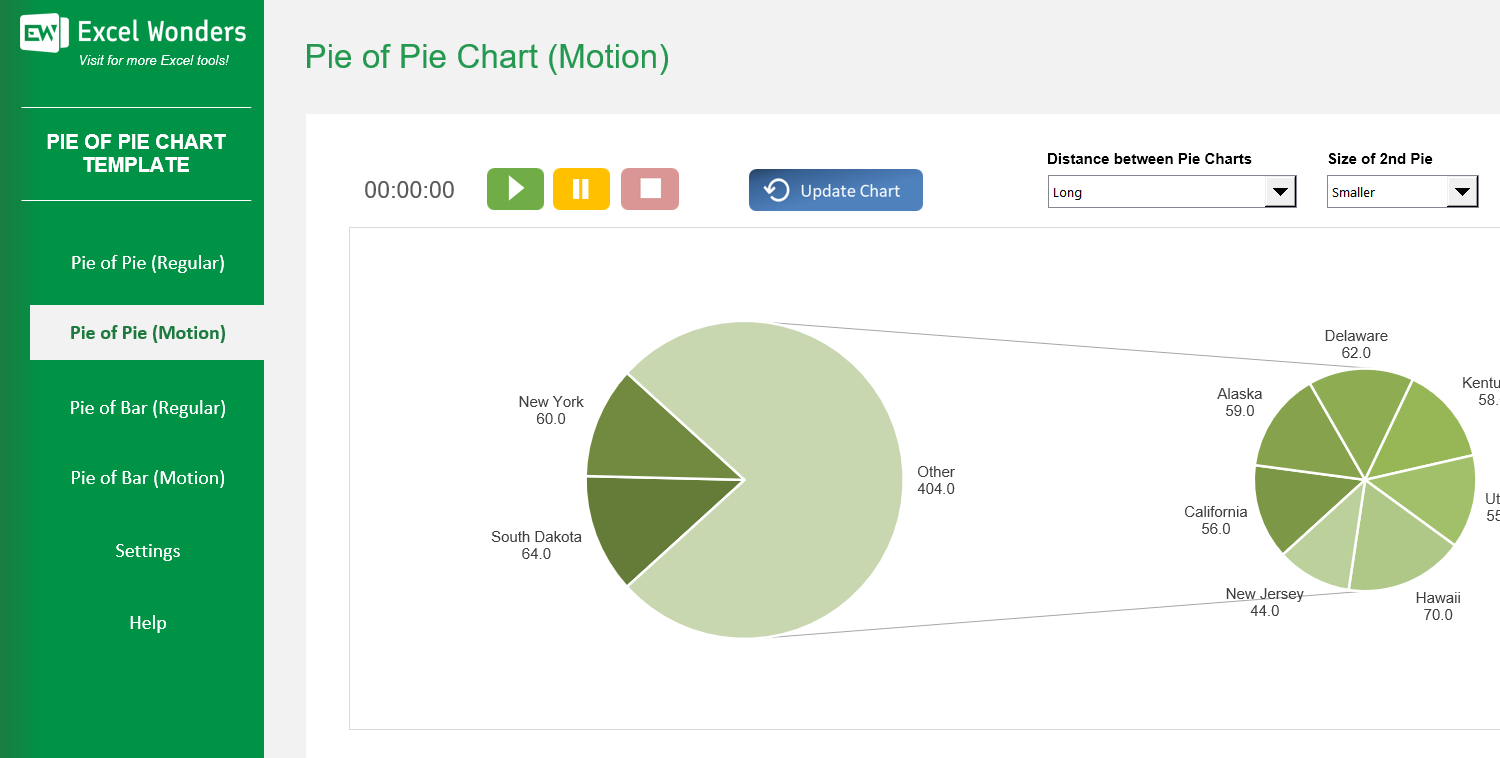
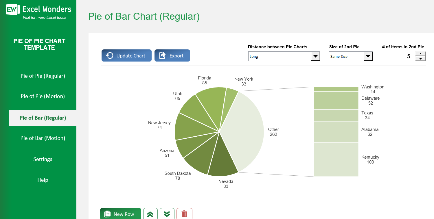
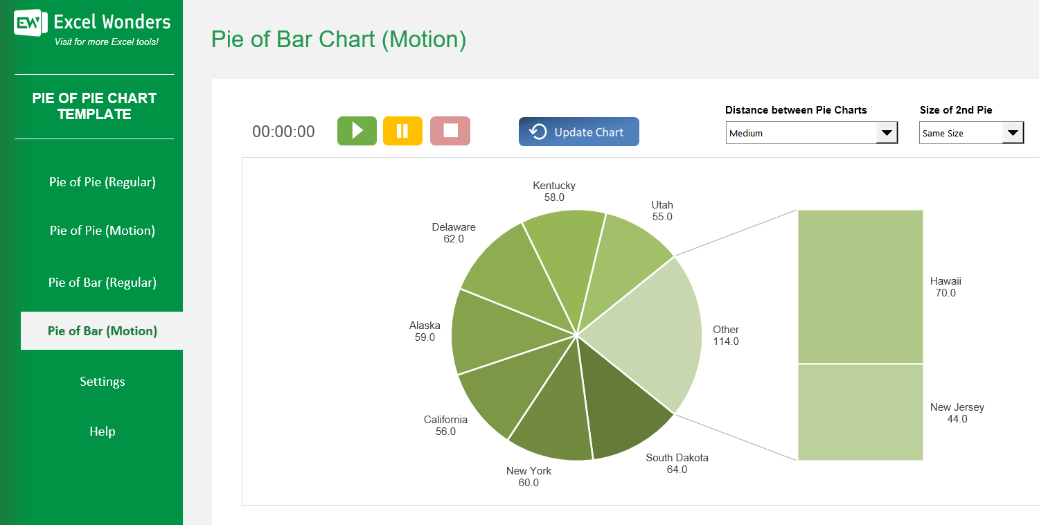
The Pie of Pie Chart Excel Template allows you to create both pie-of-pie and bar-of-pie charts, intended to make it easier to visualize smaller slices of a pie chart or single out a specific group in that first pie chart and break it down across sub-items of that element.
The Pie of Pie Chart Excel Template allows you to create both pie-of-pie and bar-of-pie charts, intended to make it easier to visualize smaller slices of a pie chart or single out a specific group in that first pie chart and break it down across sub-items of that element.
Struggling to present detailed data in a clear, engaging way? Our Excel Pie Chart Template solves that by turning complex figures into impactful pie-of-pie and bar-of-pie visuals that highlight every segment without losing clarity.
With intuitive controls, you can quickly move data between charts, adjust sizes, and fine-tune spacing — ensuring your presentation looks polished and professional.
Developed by Excel visualization experts, this template blends precision with flexibility, making it ideal for analysts, marketers, and educators aiming to communicate insights effectively.
Trusted by data professionals worldwide, it includes customizable options, dynamic animation, and built-in export tools designed to save you time and impress your audience.
Features:
Sorry! No Reviews Yet!
At the moment, we don't have any reviews for the Pie of Pie Chart Excel Template.
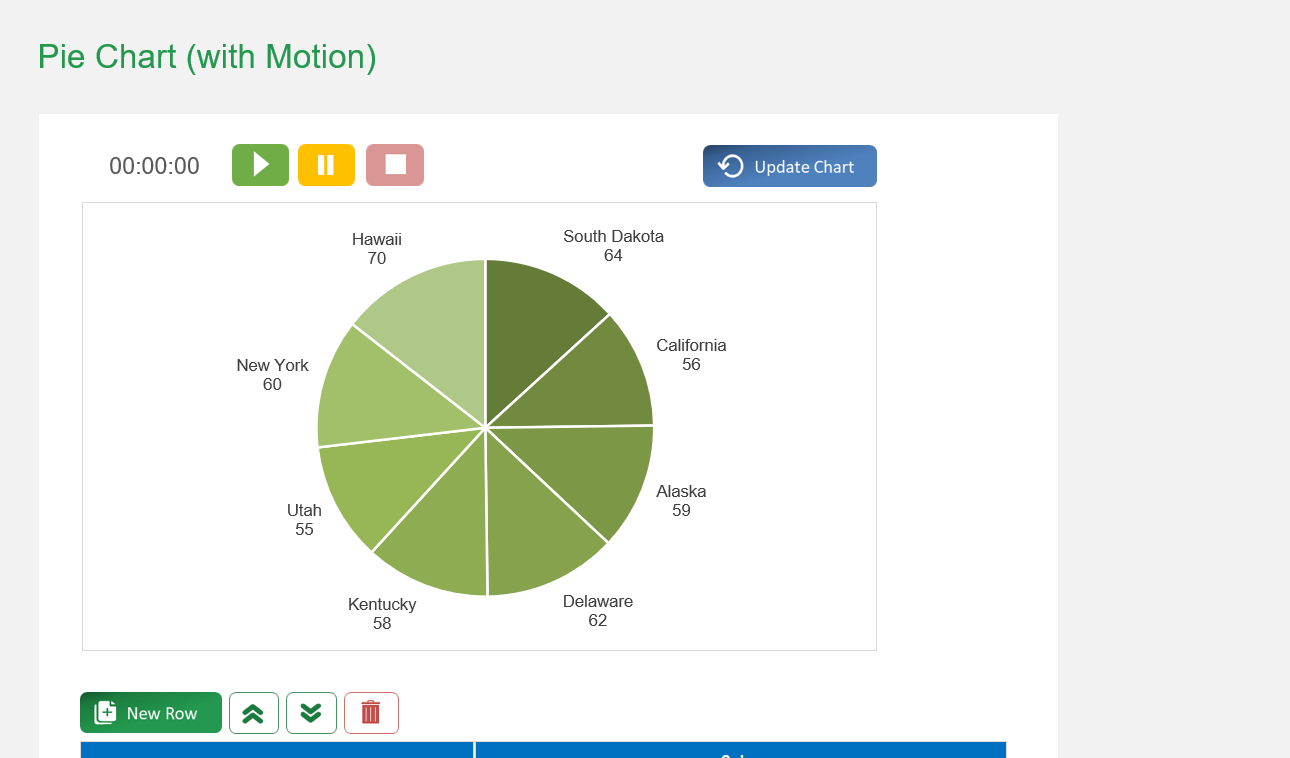
On the 'Regular' sheet, use the data table located below the chart. You can edit data directly, add a new entry with the 'New' button, delete an entry, or reorder the rows.
Yes. Click the 'Export' button in the top-right corner. A dialog box will appear where you can set the file name, type, and location to save the chart as a separate file.
If the chart does not refresh automatically after you edit the data table, click the 'Update Chart' button in the top-right corner to apply your changes.
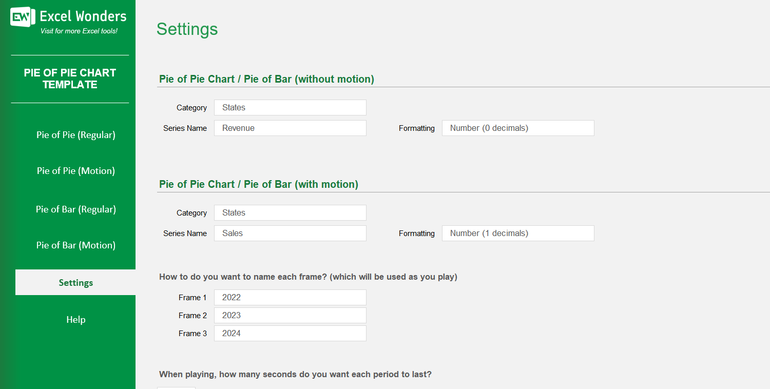
The three data columns represent the different stages or periods for the animated chart (e.g., years, quarters). You can enter the values for each period in these columns and customize their labels in the 'Settings' sheet.
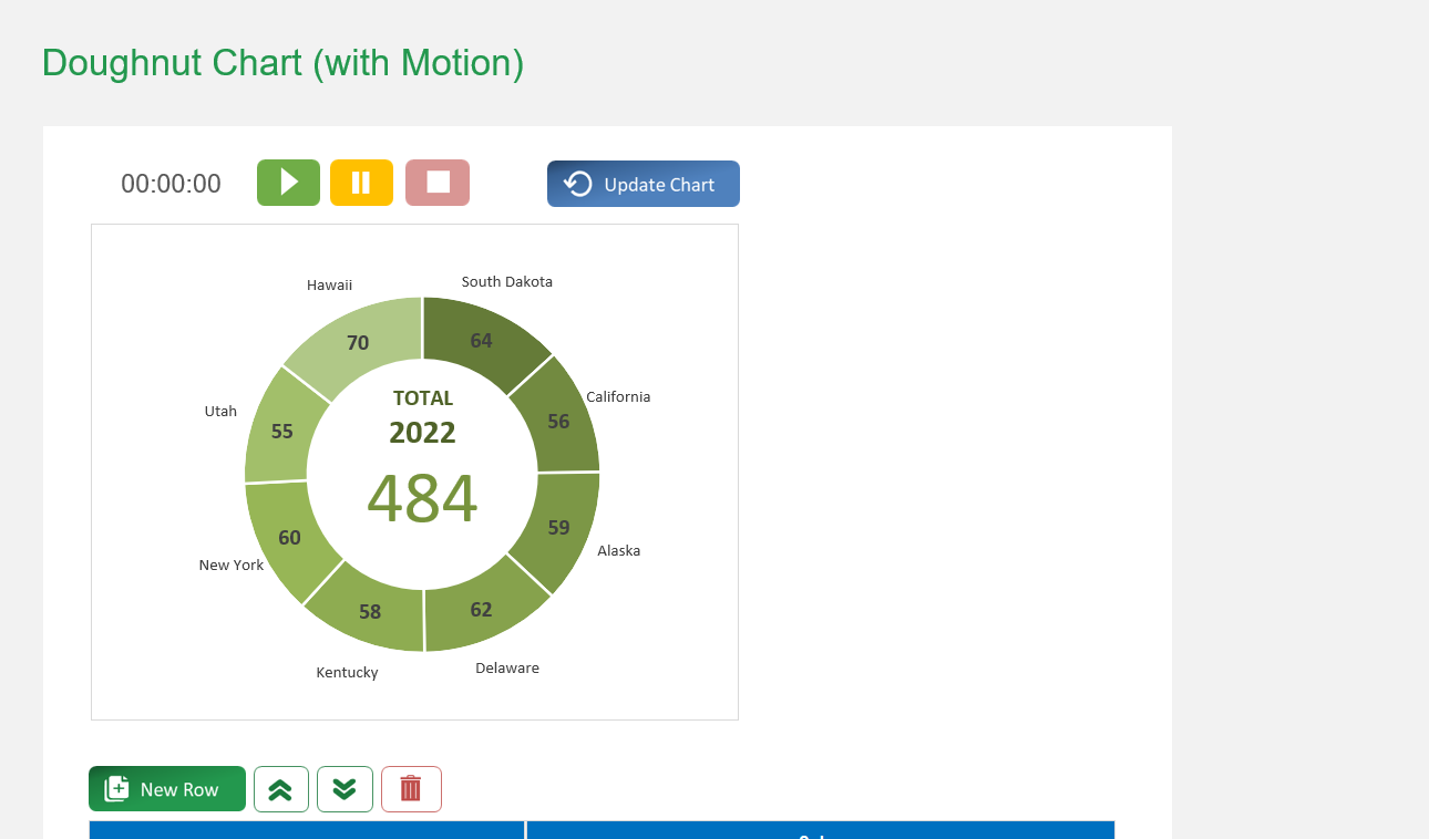
On the 'With Motion' sheet, use the data table located below the chart. You can edit data directly, add a new entry with the 'New' button, delete an entry, or reorder the rows.
Go to the 'Settings' sheet. You will find an option to set the animation pace by entering the number of seconds you want between each period transition.
Yes. You can customize the column headers for the data tables on both the 'Regular' and 'With Motion' sheets by editing them in the designated area on the 'Settings' sheet.
The template offers two types of pie-of-pie charts: • 'Regular': Creates a standard, static pie-of-pie chart. • 'With Motion': Creates an animated pie-of-pie chart that transitions through three distinct time periods or stages.